Wallet Widgets

UX/UI Wallet App Widgets Design

Screenshots of digital wallet interfaces displaying account balances, transactions, ticket counts, and expiration dates for a credit card, a cash account, and a crowd of visitors.
Comparison of three different sizes of digital wallet widgets labeled Small, Medium, and Large, showing various financial details and design differences.
Infographic showing features of a small Apple Card, including a compact layout, focus on a single card with balance and due date, background to help recognition, essential information highlighting, and ideal for quick overview.
An infographic showing a digital wallet interface. It has a black border and a gold and gray color scheme. The wallet displays an Apple Card ending in 1747, with a balance of $232.60 and available amount of $146.02. The due date is 03/05, placed aside for clarity. The infographic has labels explaining the design choices: clear layout, balance simplicity, color scheme consistency, active credit management, and clear hierarchy with due date.
Infographic illustrating a large financial dashboard with segmented sections for different accounts, including a summary of credit card balance, cash balance, transactions, tickets, and visits. The background features custom images for each card, aiding visual recognition, with notes about clear hierarchy, readability, and a one-stop financial overview.
Three iPhones showing different screens with a wallet widget. The first screen shows a simple wallet with a balance of $232.60 due on March 5th. The second screen shows the same wallet with additional details, including available balance of $146.02 and due date March 5th. The third screen displays the same wallet with a pop-up overlay showing detailed account information, transactions, total tickets, and expired carwands.

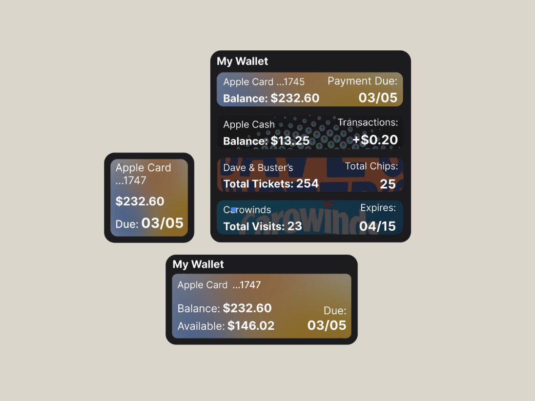
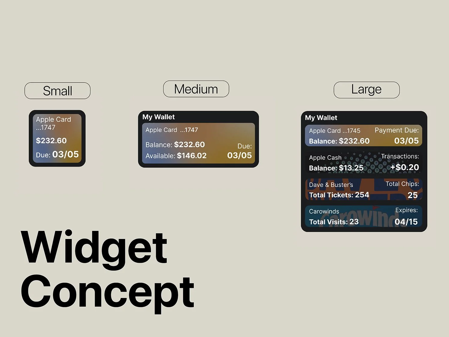
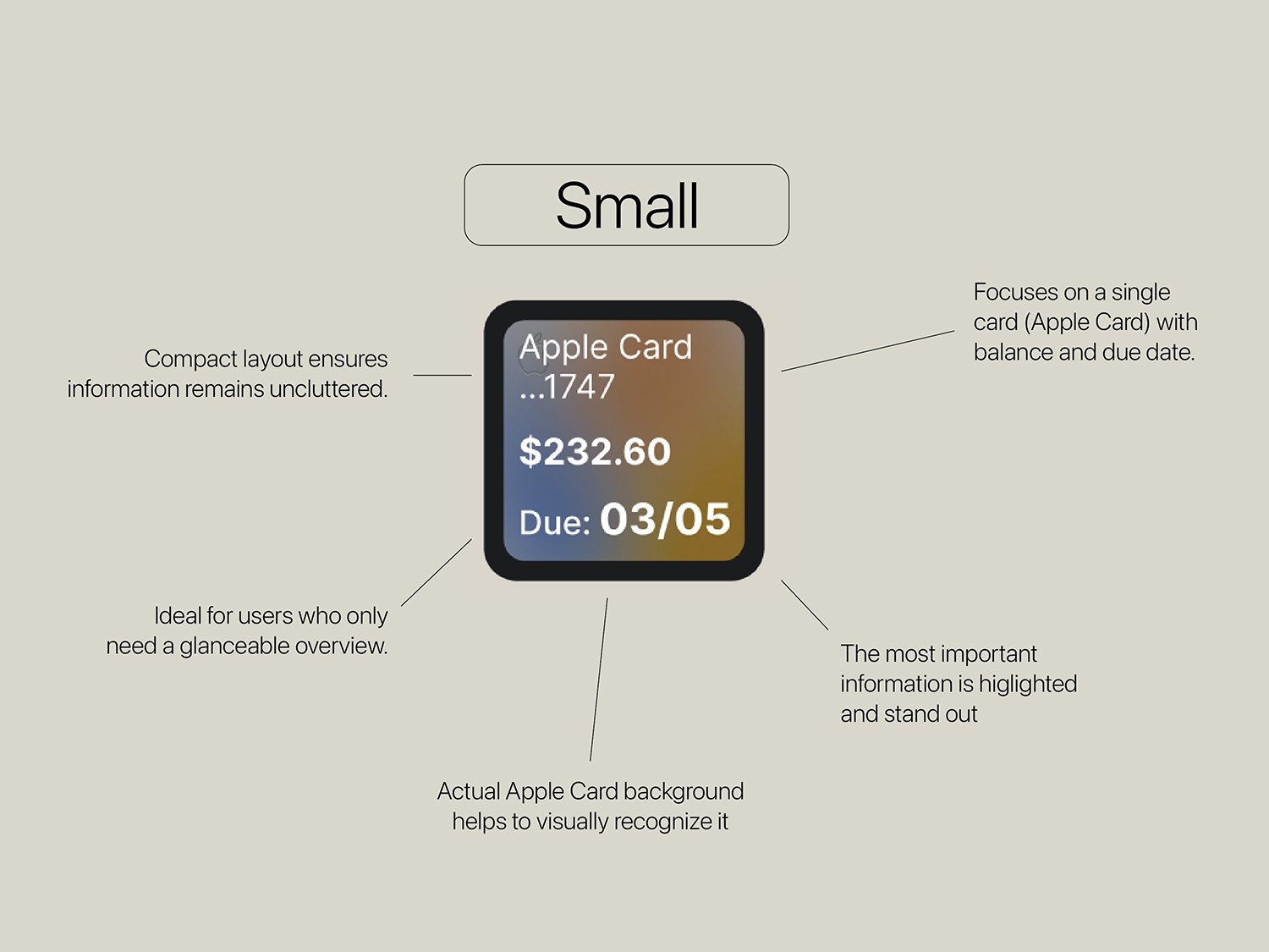
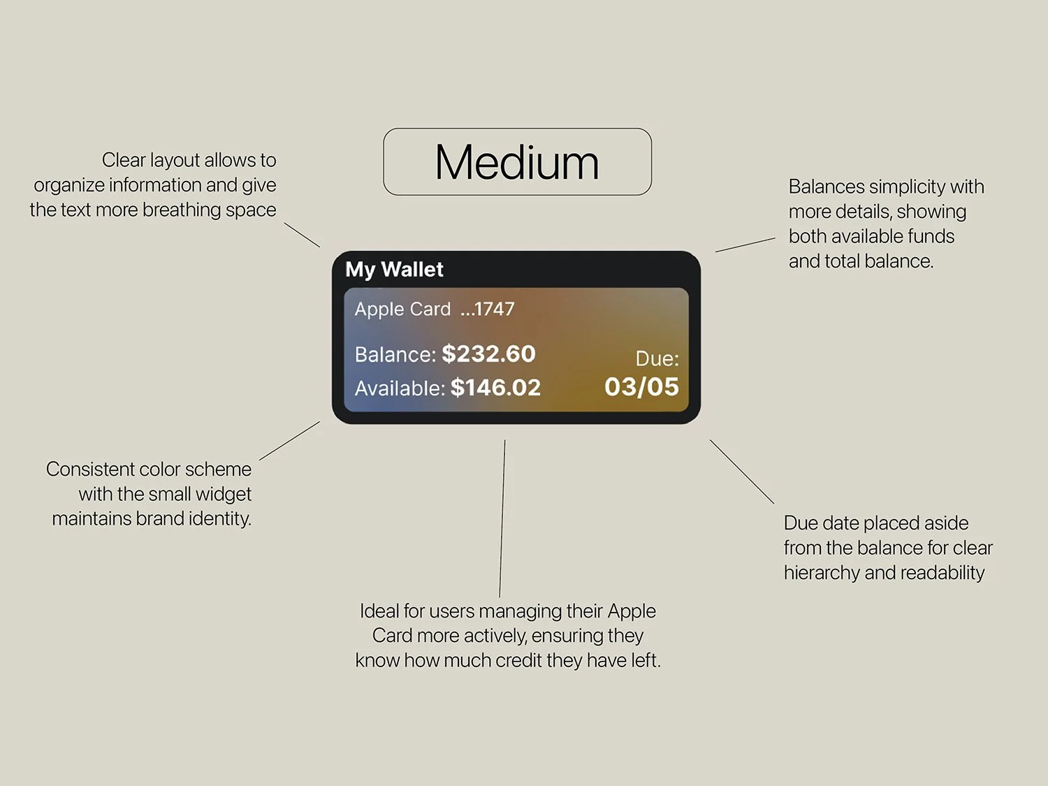
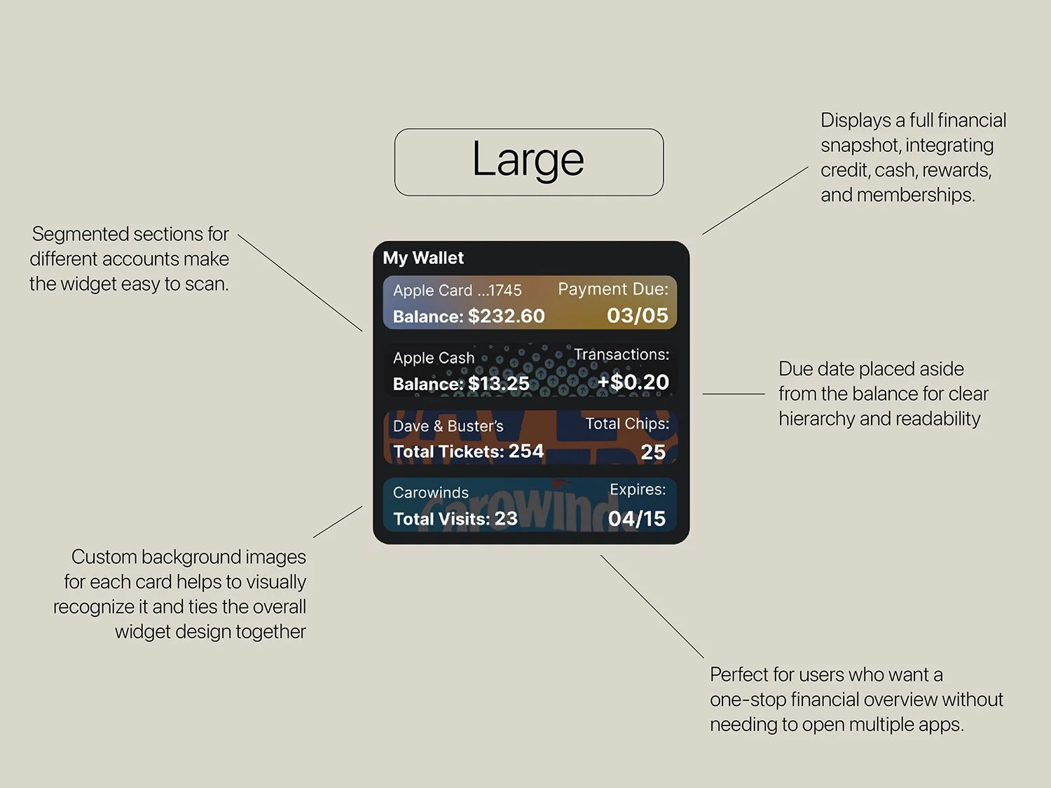
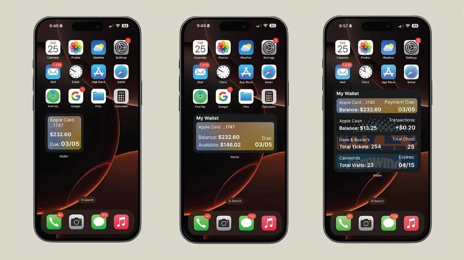
I aimed to create a set of widgets that provides a quick and convenient way to check financial information without opening the app. All the important information appears clearly and users can quickly access it from the home screen. Seeing financial data at a glance helps prevent missed payments and encourages the responsible spending.

A graphic design outline with the large, bold words 'Design & User Experience Highlights' on the left side. On the right side, there are five rectangular buttons with rounded edges, each containing words: 'Minimalist,' 'Clean,' 'Clear Hierarchy,' 'Organized,' 'Cohesive,' and 'Visually Appealing.' The background color is a light beige, and the text is in black, with a clean and simple layout.

Focus on user-friendly , cohesive and organized design that alligns with the app’s existing brand.